Detail Page (Standard Level Design)
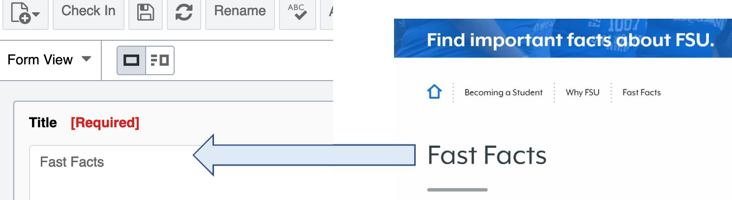
Title Field (REQUIRED)
Title will render on the page in H1 and will appear below the masthead but before the main content on the page.
Masthead
The masthead field offers the option for three different components. These components will appear at the top of the page before the title and main content. The three options available are Single Image, Single Video or Slideshow.
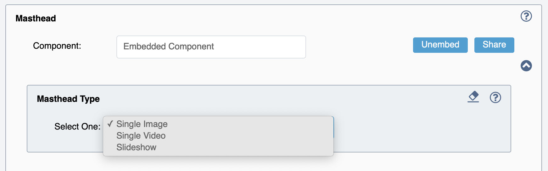
To use the Single Image select Single Image under the Masthead Type Dropdown Menu.
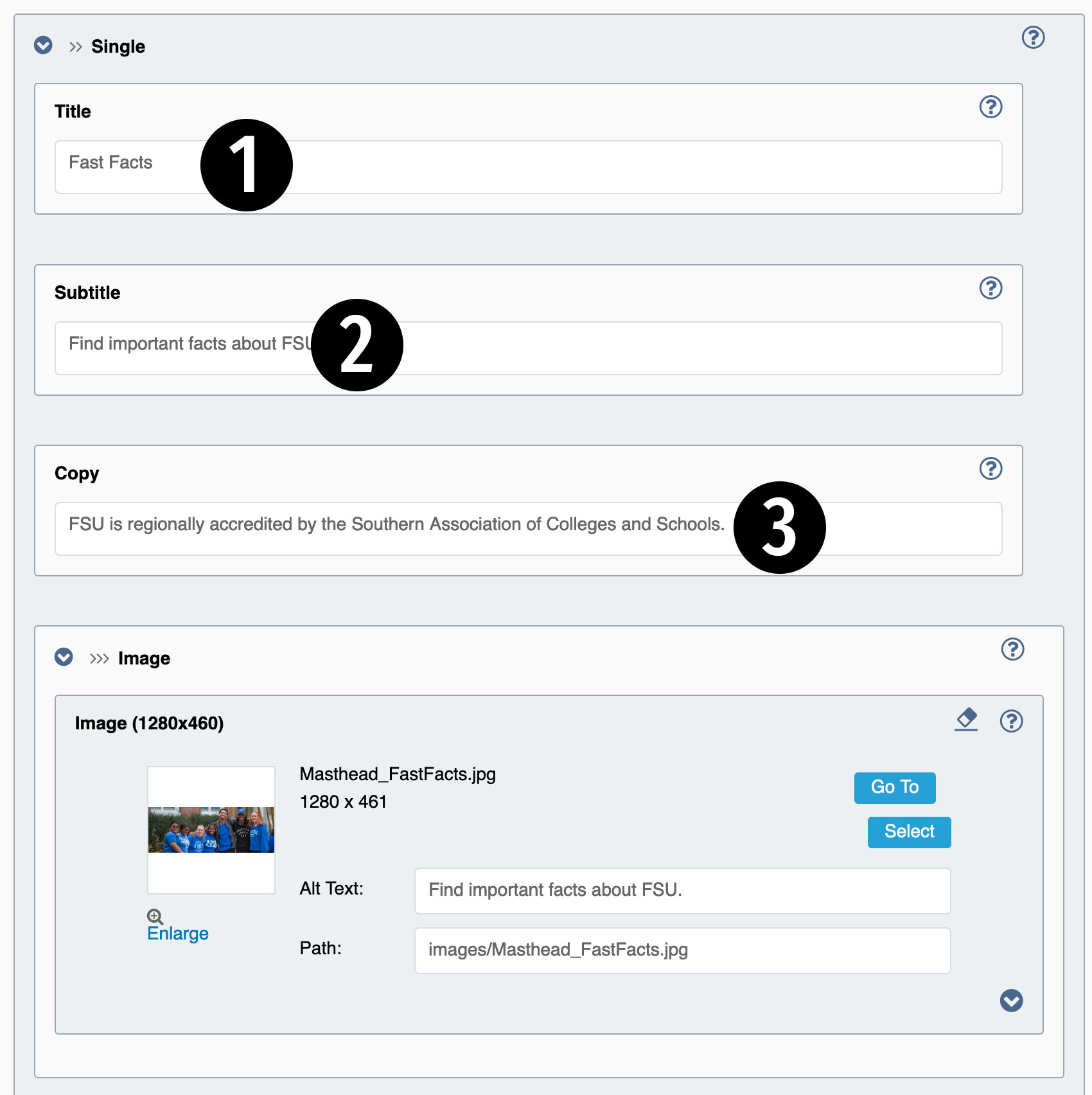
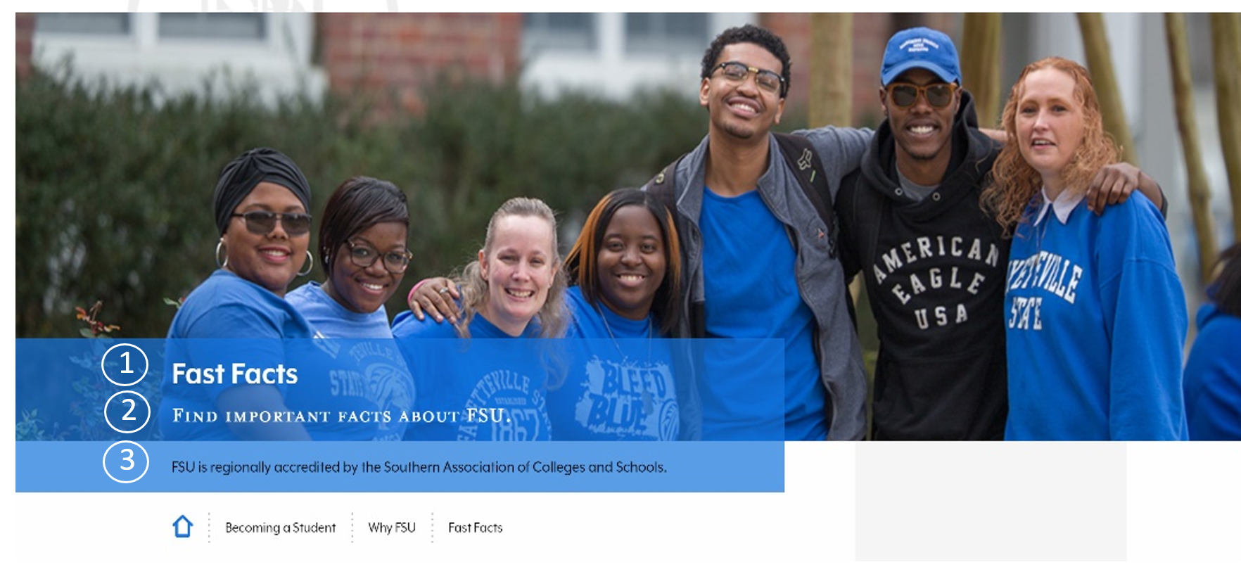
Expand the Single section of the component. There are fields for Image, Title, Subtitle and Copy. The Image should be optimized for web and the recommended size is 1280 (width) x 460 (height)
1. Title: Recommendations are 25 - 30 Characters.
2. Subtitle: Recommendations are 25 - 50 Characters.
3. Copy: Recommendations are 50- 160 Characters.
For Masthead Video - select Single Video under the Masthead Type Dropdown Menu.
The Image is needed for mobile and as a back-up if the video does not load properly. Image files should be optimized for web use and sized at 1280 (width) x 460 (height). For proper video display upload both MP4 and WEBM files to the CMS and place them in the corresponding fields for each. The Title, Subtitle and Copy fields can be used for the video component. These are the same fields used for a single image.
1. Title: Recommendations are 25 - 30 Characters.
2. Subtitle: Recommendations are 25 - 50 Characters.
3. Copy: Recommendations are 50- 160 Characters.
For Slideshow - select Slideshow under the Masthead Type Dropdown Menu. Then, expand the Slideshow and then the Slides. By default there is one slide, more slides can be added to the component by clicking on the + plus sign.
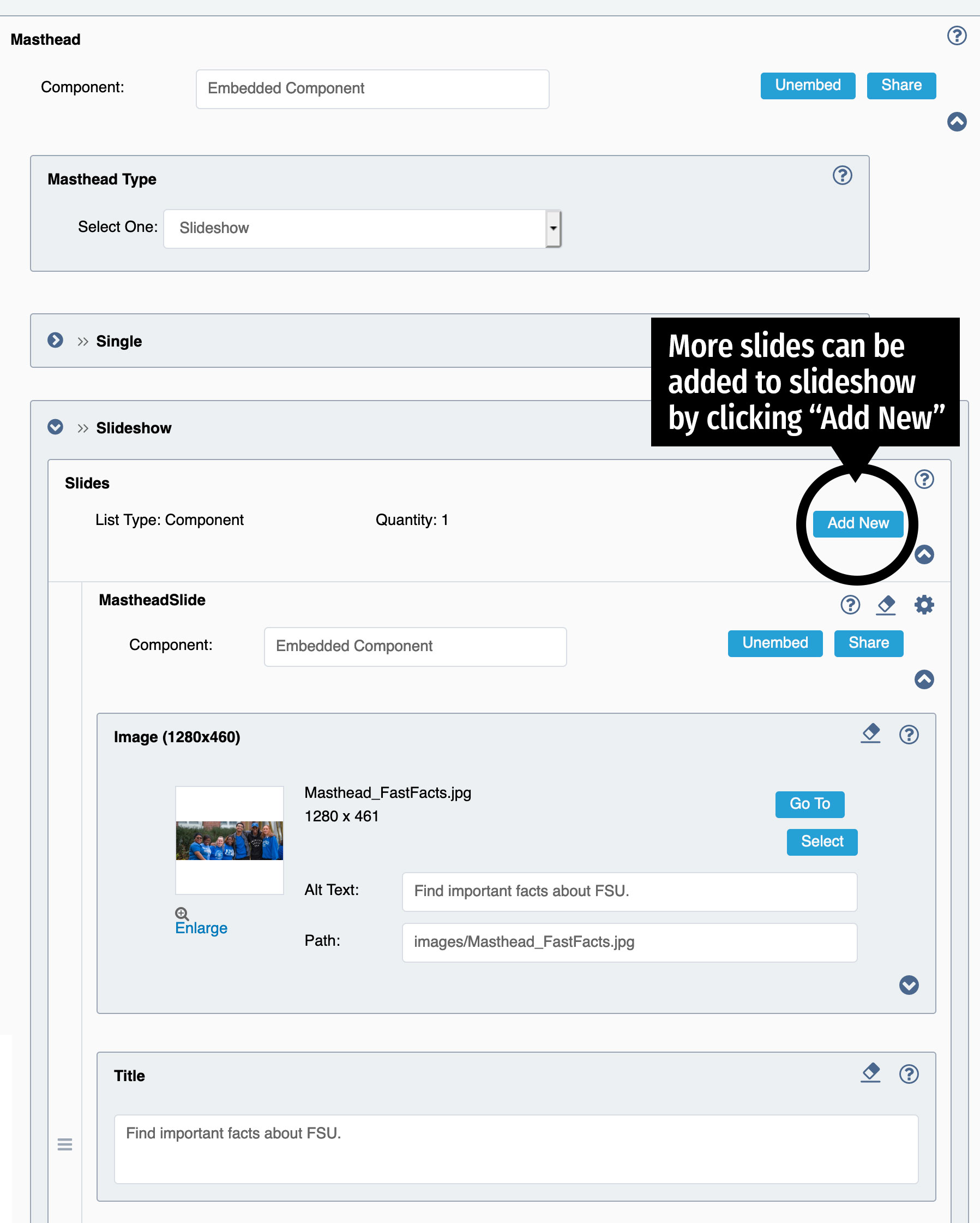
Each slide has fields for an Image, Title, Subtitle and Copy.
1. Image: Image files should be optimized for web use and sized at 1280 (width) x 460 (height).
2. Title: Recommendations are 25 - 30 Characters.
3. Subtitle: Recommendations are 25 - 50 Characters.
4. Copy: Recommendations are 50 - 160 Characters.
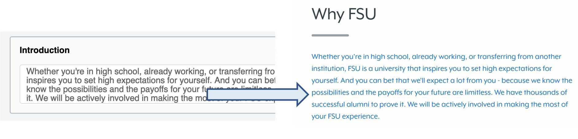
Introduction
This is a plain text field that will format all copy to the large blue text found directly below the page title and right before the main content.
Content Recommendations: try to limit to around 400 Characters.
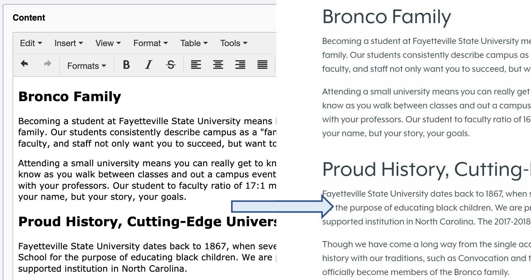
Content
The main content on the page can be added in the WYSIWYG editor:
Formats: (You don't have to style the text, just choose these from the Format Dropdown menu.)
Header 1
Header 2
Header 3
Header 4
Header 5
Header 6
Paragraph
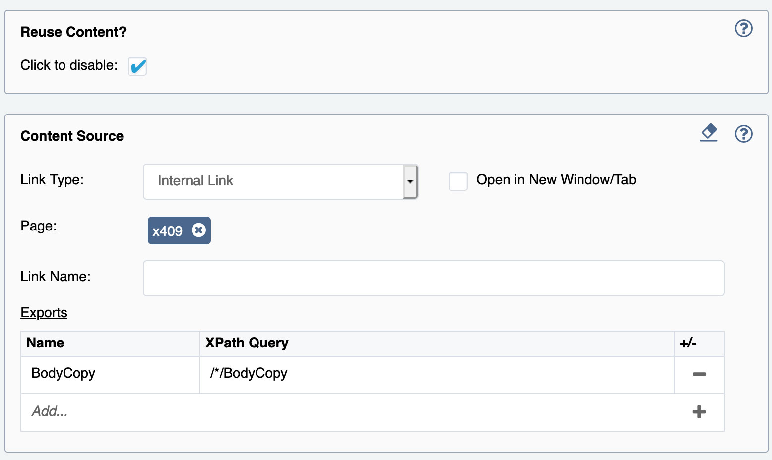
Reuse Content?
The Detail Page has a feature that allows the user to share the main content from another page and pull in onto your page. To use this feature make sure the Reuse Content checkbox is checked. Then Select the page that has the content you want to reuse. The WYSIWYG editor will remain blank, but once you preview the page the content will display.
Content Components
Content Components can be embedded or created as reusable components to be easily reused throughout the site.
Component - Infoboxes
Component - Infoboxes are a supporting content component that can be used as for Story, Quote or Stat content. Under Content Components expand the ContentItem and then expand InfoBoxes. Image is required if using this component. If no image is selected the component will not render. Content for each Type should be limited to the recommended character lengths for each, however, the content is not limited and will stretch the box and image out to accommodate all of the content for this feature.
Under the Type Dropdown menu select from quote, stat or story - depending on the content needs for each page. Expand the section that you selected in the Dropdown menu. Content requirements for each section below.
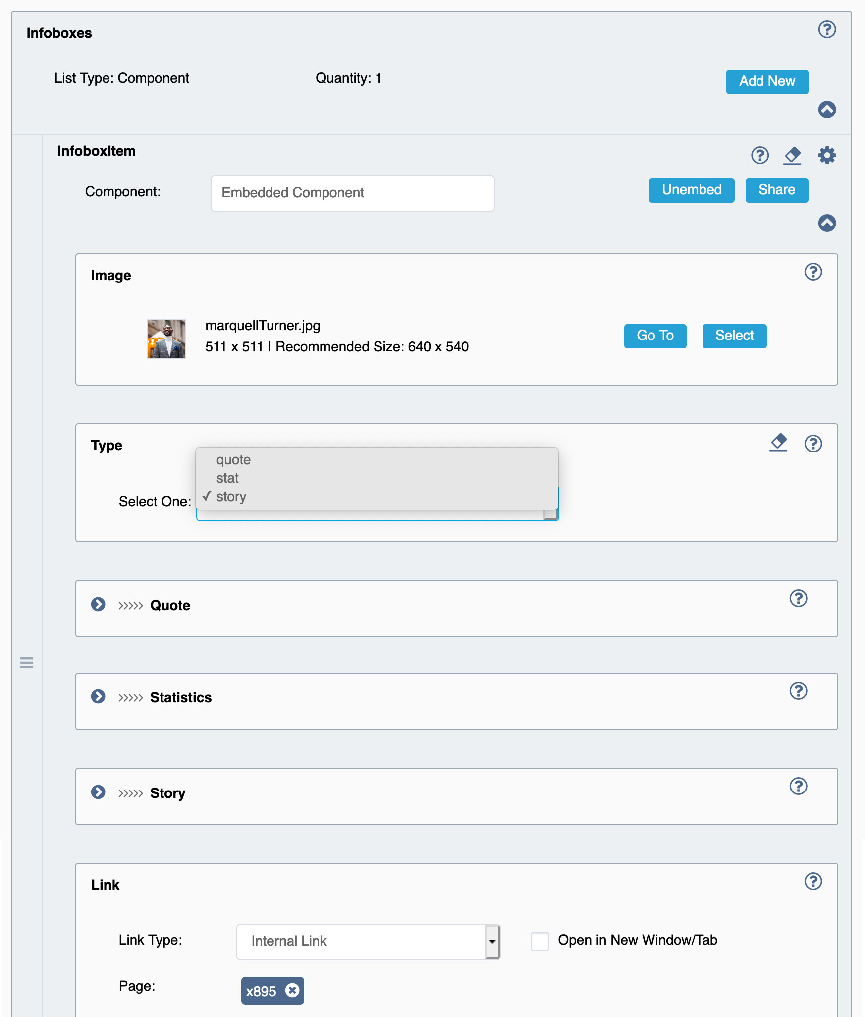
Quote Fields
Quote: Apostrophes do not need to be added. Just the quote test. Try to limit text to around 300-400 Characters.
Citation Name: Recommendations are 25 - 50 Characters.
Citation Title: Recommendations are 25 - 50 Characters.
Statistics Fields
Background Text: 4 Characters
Copy: Recommendations are 25 - 40 Characters
Story
Title: Recommendations are 15- 35 Characters
Subtitle: Try to limit text to around 25 Characters
Copy: Try to limit text to around 200-300 Characters.
Call-to-Action Link (optional for all Types): Keep Call-to-action link text limited to about 15 Characters
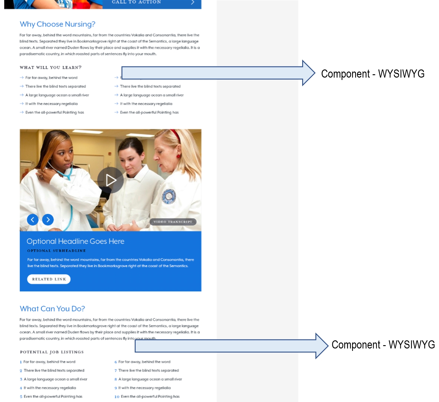
Content Components - WYSIWYG
CMS users can break up large chunks of content by using the Content Component after supplemental media or infobox components.
Content Components - Multimedia
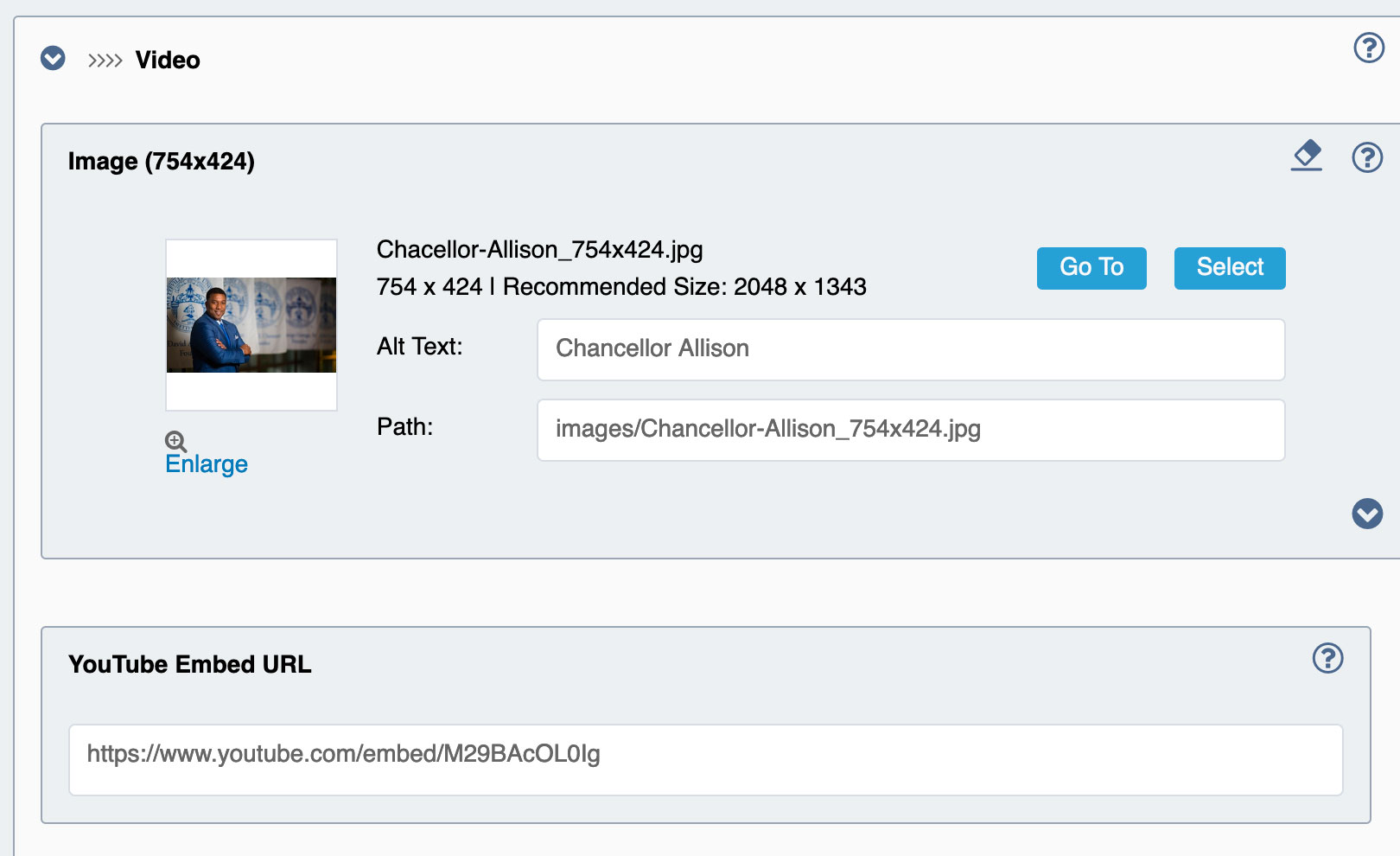
The Multimedia Component has three options for displaying images or video within the Main content section on a page. Single Image, Single Video or Slideshow are the available options for the Multimedia Component.
Under Multimedia Type select what media option you want to use. Each option has fields for:
Image: Recommended Image Size 754x424
Title: 20 -35 Characters
Subtitle: 30-50 Characters
Copy: 180-250 Characters
Call-to-action text: 15-25 Characters
If using the Single Video option include the youtube embed URL in the YouTube Embed URL under the grouped options for the video content.
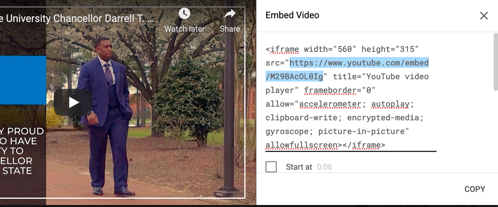
You can get the YouTube Embed URL by going to the video you wish to embed, clicking on the share option and copying the embed code. You will want to copy everything from the //www.youtube.com/embed/KdIzBhJVvG4 to place in the field.
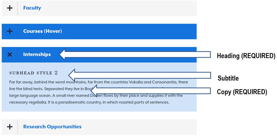
Content Components - Accordion
Accordion components can be added to the main content as well. Accordion Items have fields for Heading (Required), Subtitle, and Copy (Required) plus the ability to add more accordions by clicking on the + plus sign under Items.
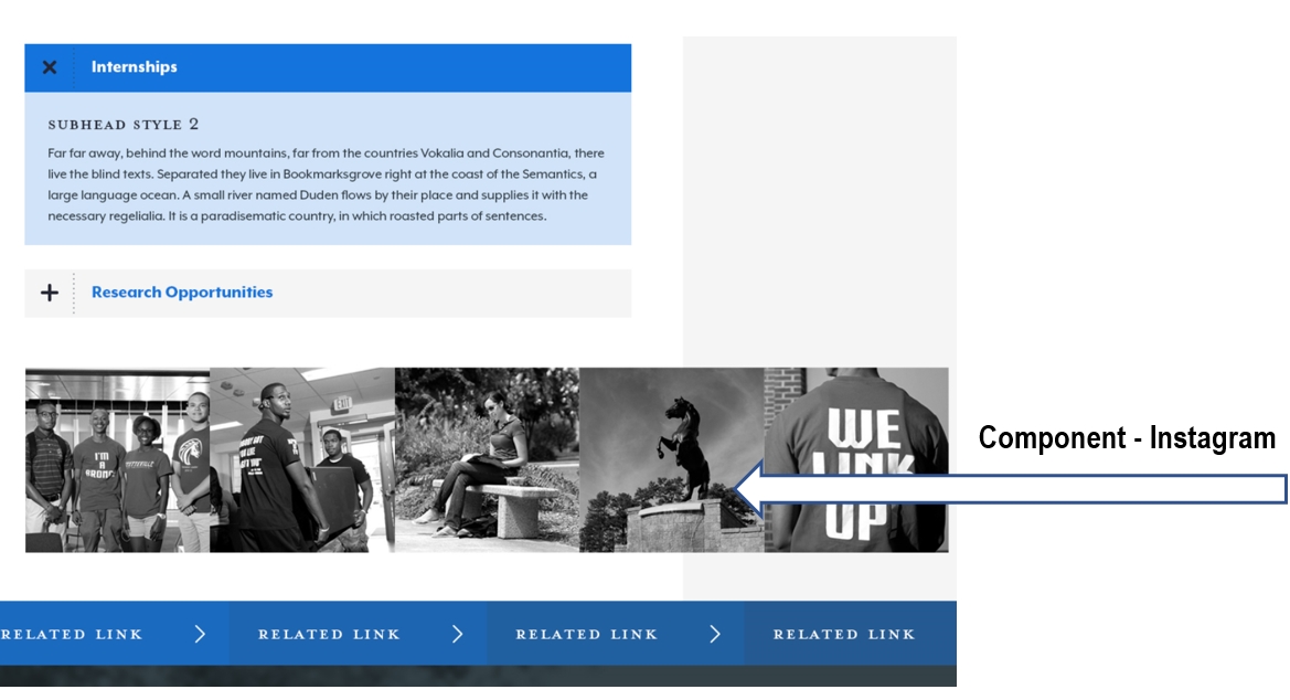
Content Components - Instagram
This schema can pull in an Instagram Feed that displays at the bottom of the page, with photos in Black and White and that change to Color for the hover state. In order to create a feed, you need numbers for the accounts User ID and Access Token. To learn how to generate IDs follow the instructions on the Instagram Developers API.
Sidebar
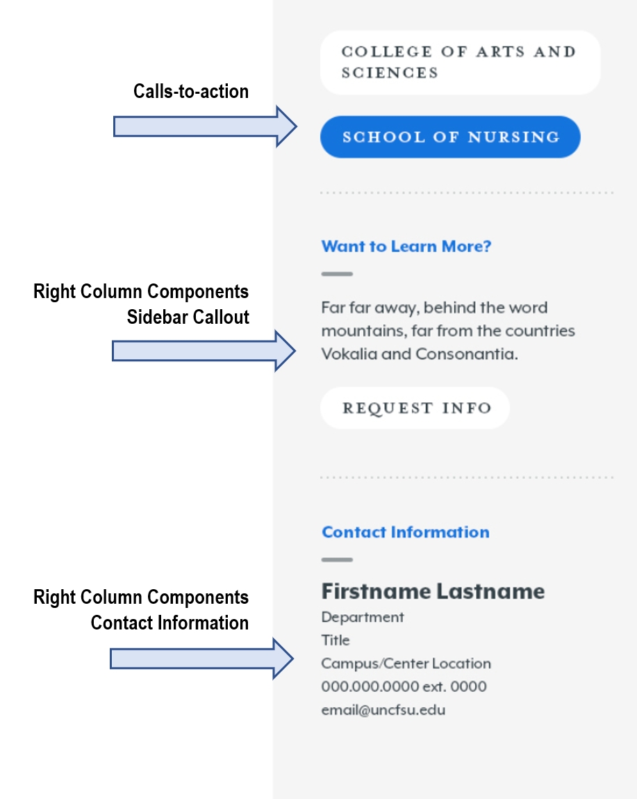
Calls to Action
The Right Column has the option to add several Call-to-Action links right below the page navigation. There are options for Internal, External and Document links. Try to limit this to 4 call-to-action buttons.
Right Column Components
Sidebar Callout
The Sidebar Callout is a flexible WYSIWYG content element that can be added to the sidebar of the page. The Sidebar Callout has fields for the Title (REQUIRED), Content, and a Call-to-action link button.
Contact Information
The Contact Information offers less flexibility than the sidebar, but styles and links the appropriate fields for the user. This component has fields for Heading (REQUIRED), Name (REQUIRED), Department, Street Address, Extended Address, City, State, Zip Code, Country, Phone, and Email.
The Heading Field will typically say "Contact Information" but is an editable field, the heading and name field are automatically styled on the page. The Phone and Email fields will automatically create links (either tel: or mailto:) of the field's contents.
Related Links
The Related Links field allows users to add more calls-to-action at the bottom of the page content. These links are automatically styled as blue buttons. This field should contain no less than 2 and no more than 4 links. The Related Links field has options for the user to create Internal, External or Document links.
Search Engine Optimization
The Search Engine Optimization section contains fields for the user to add unique meta fields for SEO purposes. Users can override the default title tag content and add unique content for the meta description and meta keywords. This section contains toggle fields to remove a page from the search index and other custom search features. Users can also add unique content to display on social media through the Open Graph content and image fields.
Page Options
Show in Nav?: Removes the page from the site navigation.
Show News/Events?: Remove the News and Events feed at the bottom of the page. Note: This option is for displaying the News/Events feature or not. To control what type of content appears in the feed see Section Control.
Navigation Display: This field changes the text of what appears in the site navigation. User short, concise names for things, but stay away from acronyms and internal naming conventions that your external audience may not be familiar with.
Breadcrumb Display: This field changes the text of what appears in the breadcrumb on the site.
Client Side Scripts: Field for a custom script to be implemented on the page.
Breadcrumbs (REQUIRED)
This should be set to default to start the breadcrumbs from the homepage. This would be updated if there was a microsite or another section of the site that had a different starting point other than the homepage.
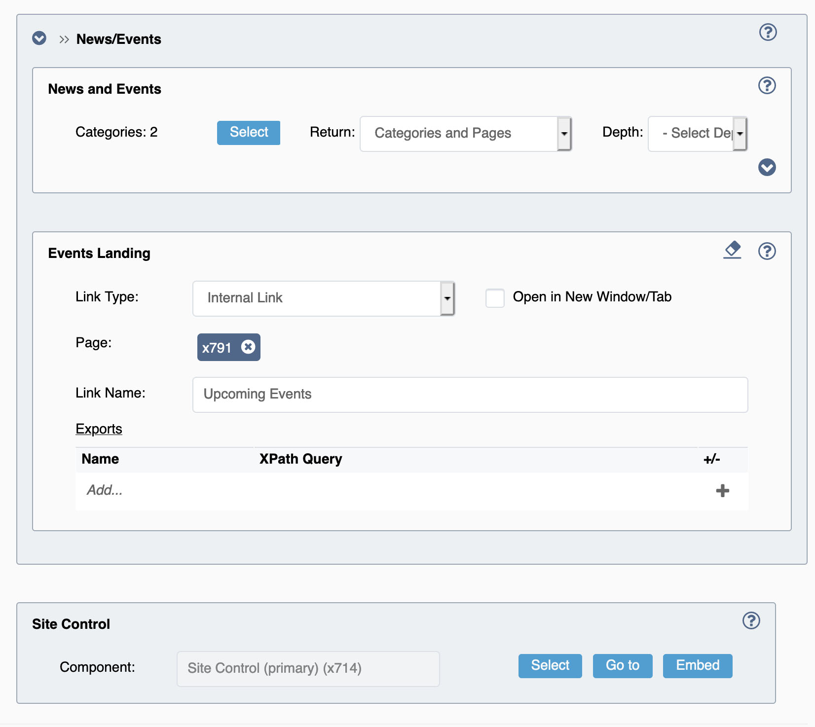
Section Control (REQUIRED)
Section Controls are needed to create the navigation for a page. In the Section Control you can also control the category for the News/Event Feed. To select the news category click on the Pick button under the News/Events Grouped items.